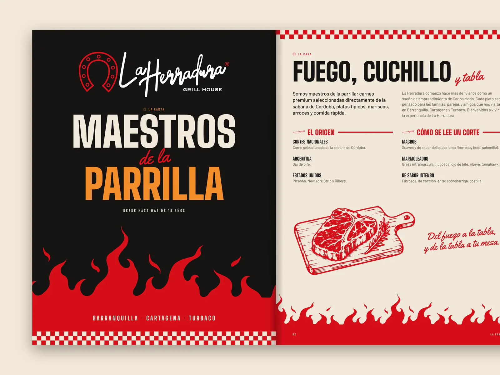
Belo Specialty Coffee
Identity, illustration and packaging for a single-origin coffee from the Sierra Nevada.
- Client
- Belo Specialty Coffee
- Year
- 2026
- Sector
- Specialty coffee · Pueblo Bello, Cesar
- Services
- Identity, Illustration, Packaging, Art direction
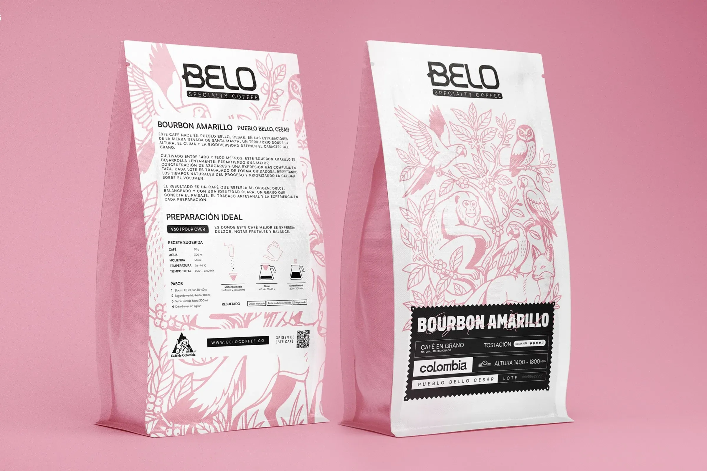
Belo sells specialty coffee from Pueblo Bello, in the Sierra Nevada de Santa Marta. We designed the identity, an illustration of the region's wildlife and plants, and a packaging system where colour tells each variety apart.
The challenge
Tell the origin story without turning the bag into a spec sheet.
Specialty coffee is bought on provenance: farm, altitude, variety, process. All of that has to fit on the bag — and the bag still has to be something you'd want on your kitchen counter.
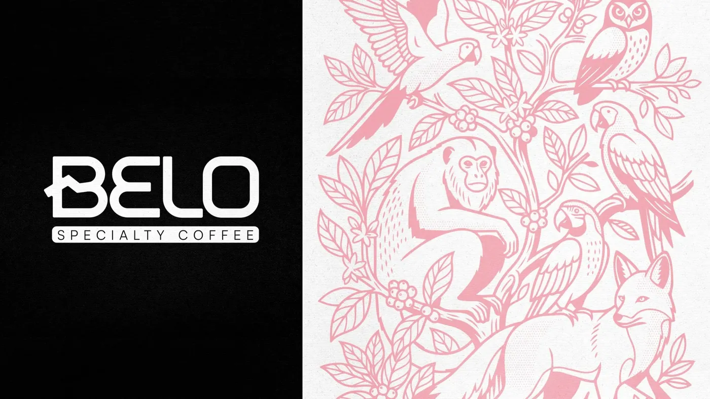
A B that is a mountain.
The «B» in the logo is distilled from a mountain — where the coffee comes from. The symbol extends the idea with layers that recall Colombia's mountain ranges.
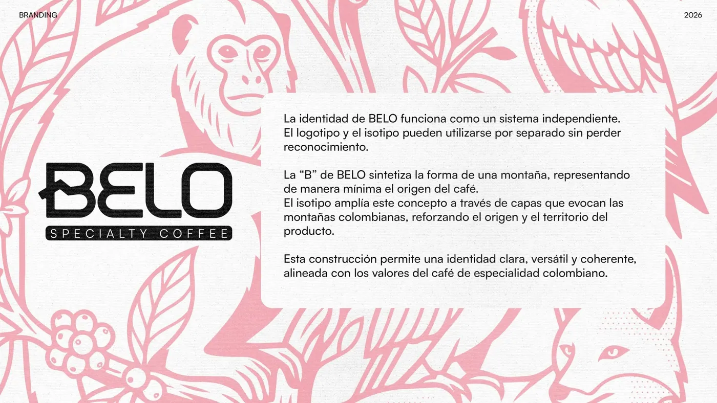
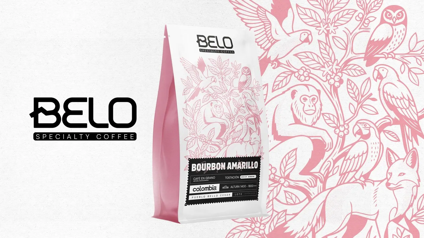
Illustration carries the origin. Type carries the data.
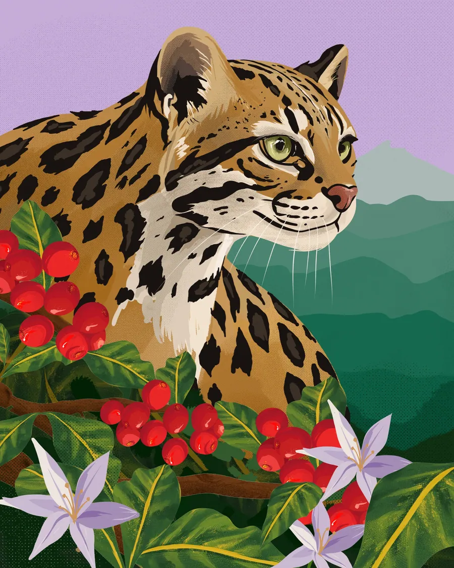
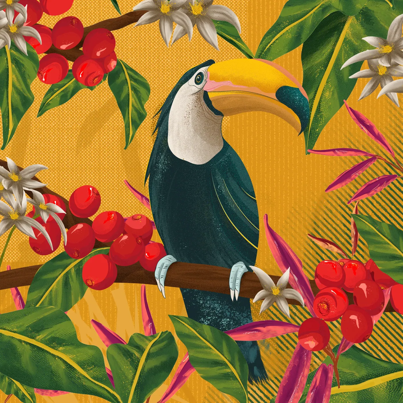
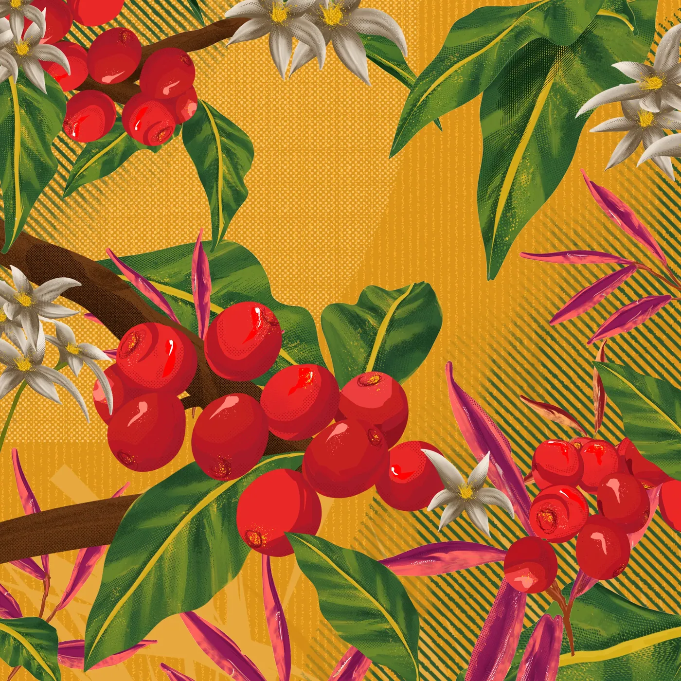
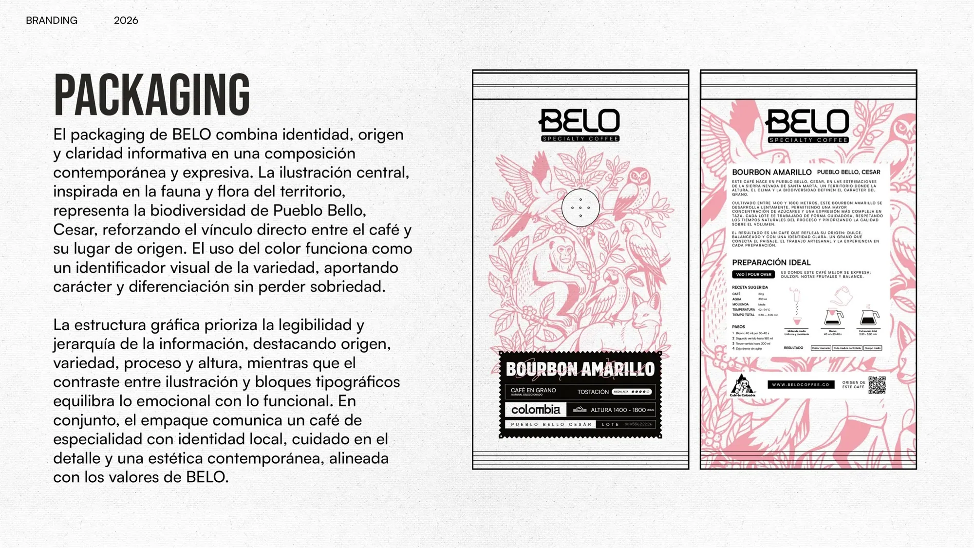
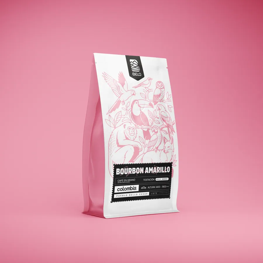
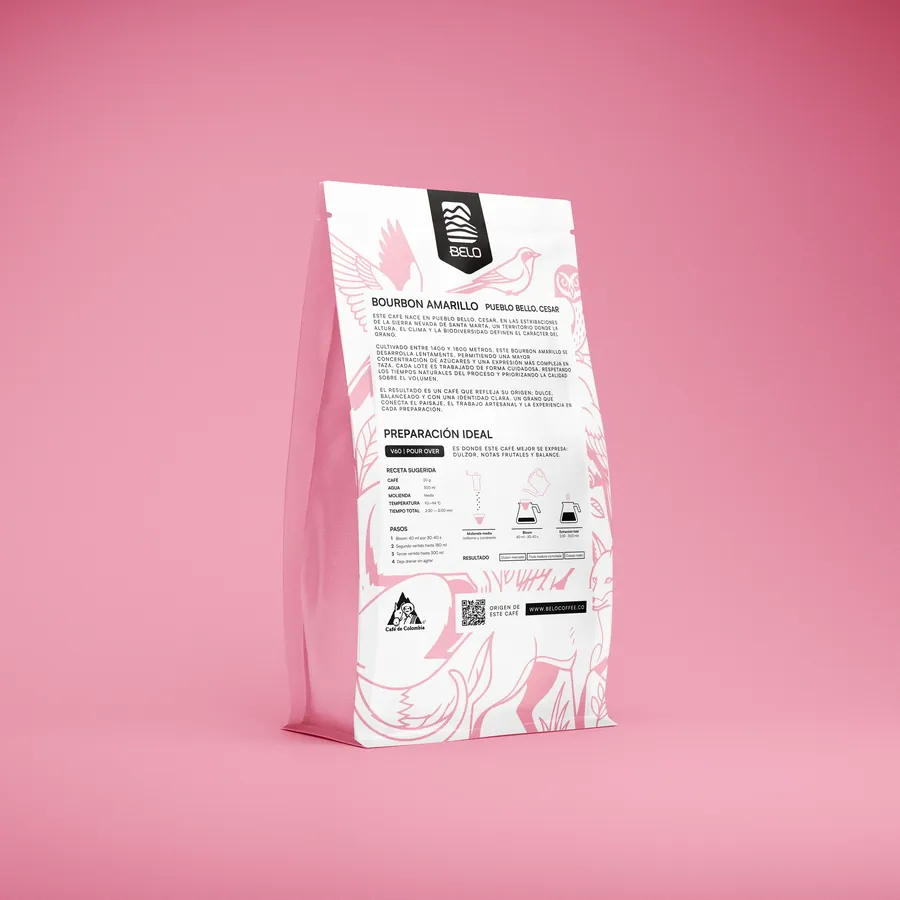
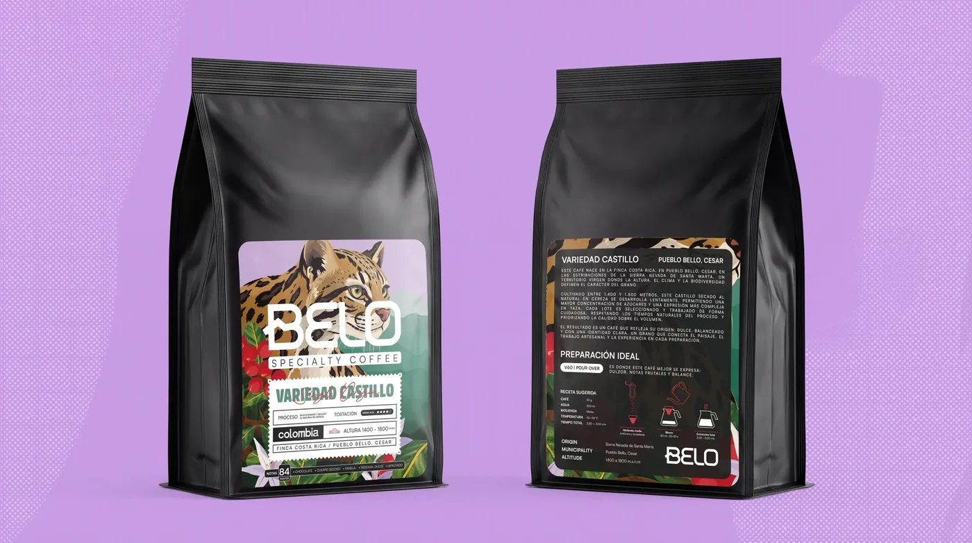
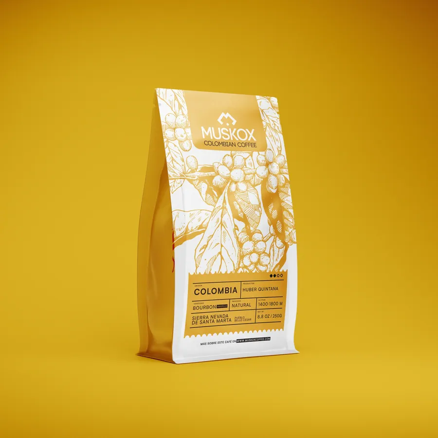
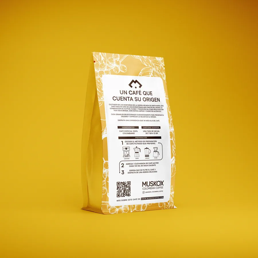
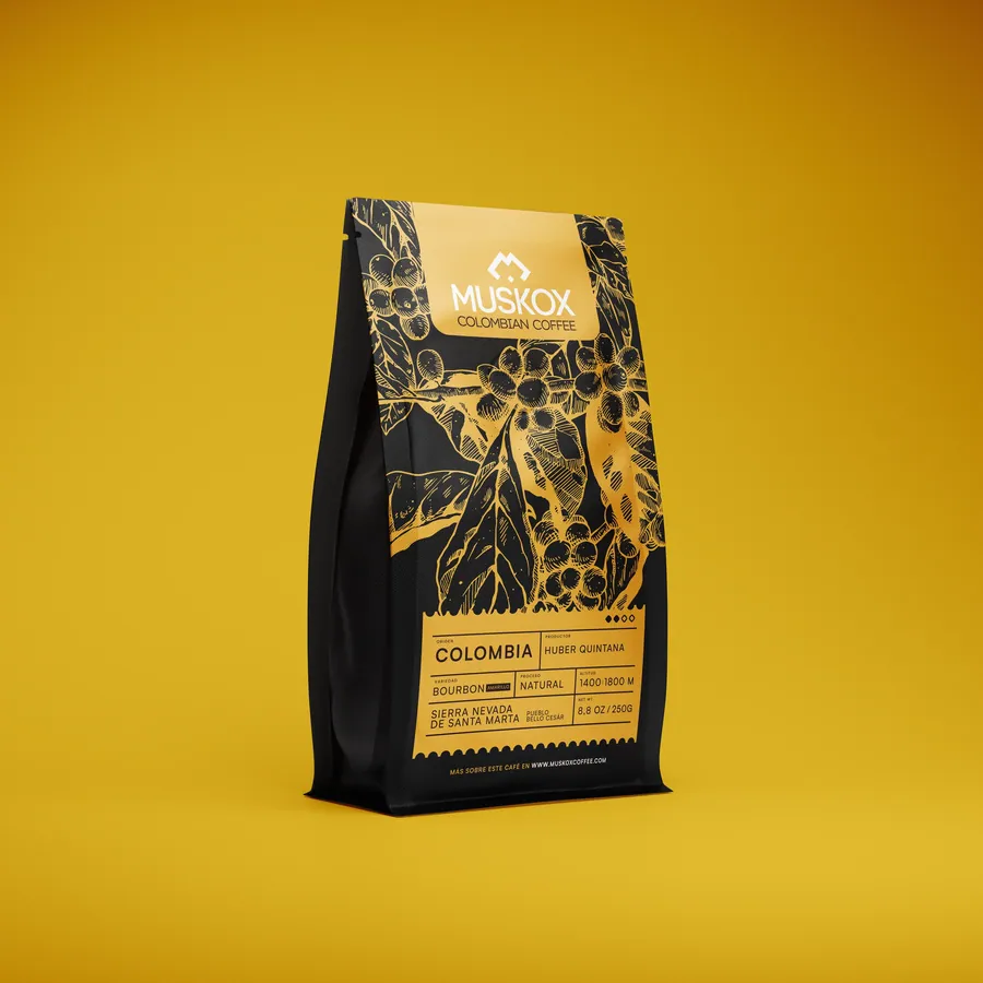
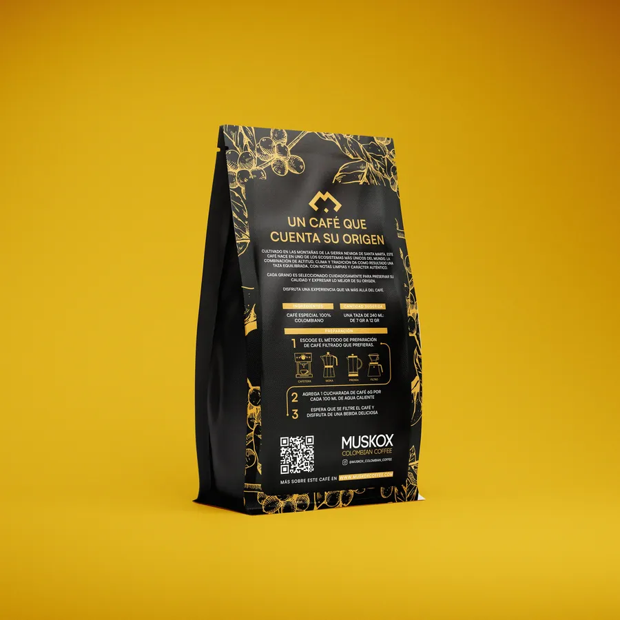
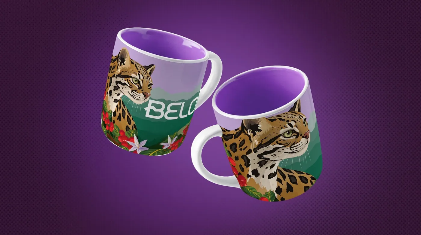
A hand-drawn illustration of Pueblo Bello's wildlife and plants — a wild cat, a toucan, a coffee tree in bloom — wraps around the bag. The technical information sits in black-on-white blocks: variety, process, altitude and brewing.
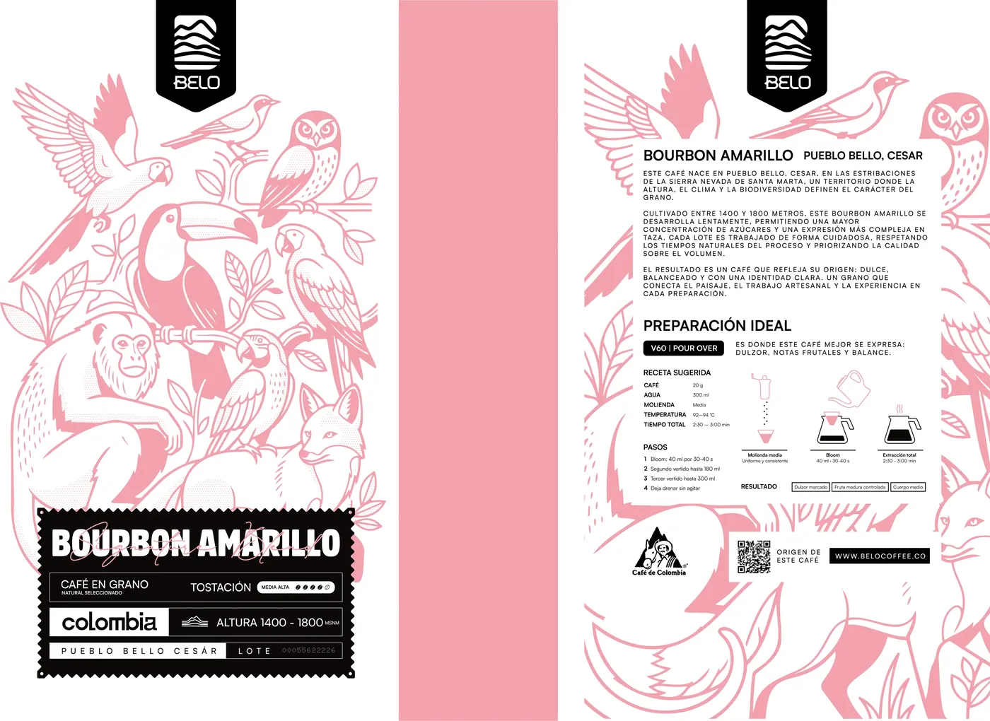
Colour identifies the variety. Nothing else.
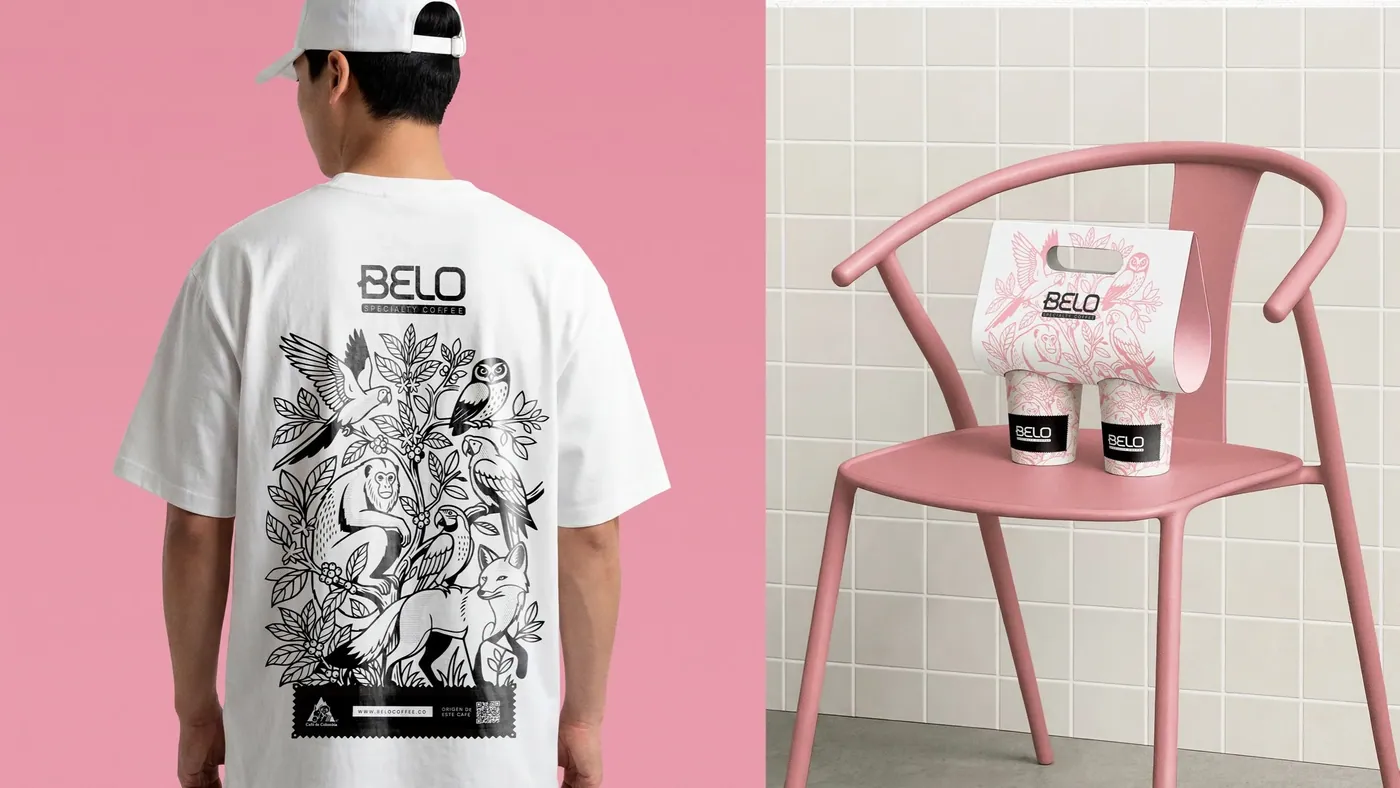
Each variety gets its own colour — pink for Yellow Bourbon, black for Castillo — so every new lot slots into the system without a redesign. The same logic carries a second line, Muskox.
Beyond the bag.
The illustration moves onto mugs, T-shirts and tote bags.
Deliverables
- Logo and symbol
- Wildlife and plant illustration
- Label and packaging system by variety
- Second line (Muskox)
- Applications: mugs, T-shirt and tote
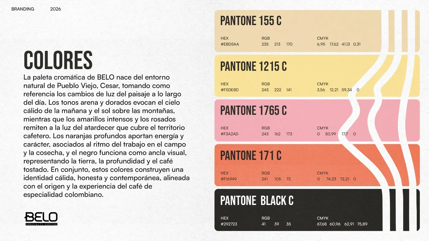
- Palette with Pantone references